Quick Tip: How to Create a Memphis Style Text Effect in Adobe InDesign

Final product image
What You’ll Be Creating

This quick and quirky text effect is the perfect way to channel the Memphis Style, the 1980s design movement whose signature is geometric shapes and bold color.

Here, we’ll look at how to create the text effect in InDesign. Short on time? No problem! It only takes 15 minutes to put together.

To make your effect even more unique, you could swap in alternate Memphis-inspired and geometric patterns from Envato Elements.

What You’ll Need to Create Your Text Effect

As well as access to Adobe InDesign, you’ll also need to have Adobe Illustrator or other vector software to hand for editing pattern graphics. 

1. How to Set Up a Color Palette for Your Effect

Step 1

Open InDesign and go to File > New > Document. 

You can create your document at any size, but to match the dimensions specified here, set the Page Size to A3 and orientation to Landscape. Deselect Facing Pages. Click Create.

With the rulers visible (View > Show Rulers), drag a guide down from the top ruler to Y position 111 mm and a second to 186 mm. 

guides

Step 2

From the left-hand ruler, pull out a guide to X position 47 mm and a second to 82.5 mm. 

guides

Select both guides and Edit > Copy, Edit > Paste, moving the pasted pair over to the right, allowing the left-hand guide to overlap the original 82.5 mm guide. This will create a trio of guides, with two equal columns. 

guides pasted

Step 3

Expand the Swatches panel (Window > Color > Swatches) and choose New Color Swatch from the panel’s drop-down menu. 

With the Type set to Process and Mode to CMYK, set the levels below to C=0 M=76 Y=0 K=0. Click Add, and then OK.

Repeat to create a further six new CMYK swatches:

  • C=59 M=0 Y=25 K=0
  • C=63 M=0 Y=12 K=0
  • C=0 M=52 Y=0 K=0
  • C=2 M=9 Y=91 K=0
  • C=53 M=0 Y=34 K=0
  • C=4 M=83 Y=84 K=0
swatch options

2. How to Build Up Lettering for Your Text Effect

Step 1

Use the Rectangle Tool (M) to create a small rectangle about 13 mm in Width, positioning it against the left-hand guide and extending it up to the guides sitting above and below. 

From the Swatches panel, set the Fill Color of the shape to the red swatch, C=4 M=83 Y=84 K=0.

red shape

Select the shape and go to Object > Effects > Transparency, changing the Mode to Multiply.

multiply

Step 2

Use the Pen Tool (P) to create a diagonal rectangle running from the top-left corner of the red shape, allowing its center to meet in the middle of the central guide. 

pen tool

Set the Fill of the shape to C=0 M=52 Y=0 K=0. Then go to Object > Effects > Transparency and adjust the Mode to Multiply

effects multiply

Step 3

Use the Line Tool () to create a diagonal line from the bottom-right point of the pink shape, meeting at the intersection of the top and right guides. 

line tool

Copy and Paste the line, creating a group of evenly spaced lines, with the far-left line meeting the bottom-left corner of the pink shape. 

Select all the lines and Right-Click > Group.

group

Step 4

Copy and Paste the red rectangle and move it into position to create the final section of the ‘M’. Set the Fill of this shape to C=53 M=0 Y=34 K=0.

swatches panel

Select all the elements making up the ‘M’ and Right-Click > Group. 

group

Step 5

Create a second trio of vertical guides to the right of the ‘M’, making them slightly narrower in width than the ‘M’.

guides

Paste the rectangle shape again, using it to create the left side of an ‘E’, and setting the Fill to C=0 M=76 Y=0 K=0.

Paste a second rectangle, rotating it to a horizontal position and shortening its length to make the top bar of the ‘E’. Set the Fill to C=2 M=9 Y=91 K=0.

yellow shape

Step 6

Copy and Paste the yellow rectangle, moving it down to create the lower bar of the ‘E’. Set the Fill to C=63 M=0 Y=12 K=0.

Right-Click on the blue shape and choose Content > Graphic.

content graphic

Step 7

Minimise the InDesign window for a moment and open the vector patterns image in Illustrator

Isolate one of the halves of the circles set in a dotty pattern, and Edit > Copy this. 

patterns

Create a new Illustrator document and Edit > Paste it onto this artboard. With the color of the dots set to Black, File > Save As the image as an Illustrator EPS file, with a transparent background. 

dotty shapes

Repeat for one of the squiggly patterns, saving this as its own file as well.

squiggle shapes

Step 8

Head back to your InDesign document. 

With the blue shape now set as an image frame, select it and go to File > Place. Navigate to the dotty EPS file and Open, allowing it to fill the shape. 

placed image

Step 9

Use the Line Tool () and hold Shift to create a horizontal line across the center of the ‘E’.

line tool

From the Stroke panel (Window > Stroke), set the Weight of the line to 4 pt and Type to Wavy

wavy line

Copy and Paste the line repeatedly, creating a block of wavy lines, and then Right-Click > Group to hold them together. 

group

Step 10

Select the trio of vertical guides marking out the first ‘M’, and Edit > Copy, Edit > Paste them, moving them to the right of the ‘E’.

Copy and Paste the ‘M’, and move it to the right of the ‘E’ too. Select the left-hand red shape, Right-Click > Content > Graphic, and File > Place, choosing the squiggly lines EPS file. 

placed image

Step 11

To create a ‘P’, Copy and Paste the guides marking out the ‘E’, moving them to the right of ‘M’.

Copy and Paste one of the vertical rectangles, setting the Fill to C=63 M=0 Y=12 K=0. 

blue rectangle

Use the Ellipse Tool (L) to create a rough oval shape across the top of the ‘P’, extending the right edge to the far-right guide. Set the Fill to C=2 M=9 Y=91 K=0.

Use the Scissors Tool (C) to cut the oval in half, and delete the left half.

yellow oval

Set the Content of the half-oval to Graphic

content graphic

Then File > Place, choosing the squiggly lines EPS file.

placed image

Step 12

To create an ‘H’, Copy and Paste the guides marking out the ‘P’, moving them to the right.

Copy and Paste two vertical rectangles, setting the left to C=0 M=76 Y=0 K=0 and right to C=0 M=52 Y=0 K=0. 

Copy and Paste the group of wavy lines from the ‘E’ and use this to create the bridge of the ‘H’.

pink fill

Step 13

Create an ‘I’ using a copy of one of the rectangle shapes, set in your yellow swatch, C=2 M=9 Y=91 K=0.

File > Place, choosing the dotty EPS file to fill this shape. 

place image

Step 14

To create the final ‘S’ of ‘MEMPHIS’, Copy and Paste the half oval shape from the ‘P’, and rotate it into the position shown below. Switch the Fill to C=0 M=52 Y=0 K=0.

rotated shape

Copy and Paste the pink half oval, and Right-Click > Transform > Rotate 180 Degrees.

rotate

Select the image inside the shape and delete it, before adjusting the Fill to C=53 M=0 Y=34 K=0. 

fill color

Step 15

Use the Line Tool () to create a short bridging line between the two half ovals.

line tool

Copy and Paste the line repeatedly, creating a uniformly spaced group of lines. 

group

Conclusion: Your Finished Text Effect

And you’re finished! A quirky, eye-catching text effect that is a fantastic tribute to the Memphis Style. Awesome job!

You can now copy and paste the effect directly into other InDesign documents, or integrate it into Illustrator or Photoshop layouts.

To give your effect even more of a unique twist, you can track down alternate Memphis-inspired and geometric patterns from Envato Elements.

final text effect

How to Create a Pencil-Themed Seamless Pattern in Adobe Illustrator

Final product image
What You’ll Be Creating

In today’s tutorial we’re going to take a quick look at the process of creating a pencil-themed pattern in Adobe Illustrator. You’ll learn how to put it together easily using a few basic geometric shapes and tools.

Oh, and don’t forget you can always expand your library by heading over to GraphicRiver, where you’ll find a great selection of vector patterns.

That being said, take a quick sip of that magic bean juice, and let’s jump straight into it!

1. How to Set Up a
New Project File

Let’s kick things
off by setting up a New Document by
going to File > New or by using
the Control-N keyboard shortcut. Then adjust it as follows:

  • Number
    of Artboards:
    1
  • Width:
    1560
    px
  • Height:
    1360
    px
  • Units:
    Pixels 

And from the Advanced tab:

  • Color
    Mode:
    RGB
  • Raster
    Effects:
    Screen (72ppi)
  • Preview Mode: Default
setting up a new document

2. How to Create
the Background

Once we have our
new project file, we can start working on the actual pattern by creating the
background.

Step 1

Grab the Rectangle Tool (M)
and create a 1560 x 1360 px shape, which we will color using #FFD44D and then center align to the underlying
Artboard using the Align panel’s Horizontal and Vertical Align Center options.

creating and positioning the main shape for the background

Step 2

Start working on the repeating holes by creating the main shape for the
initial instance using a 120 x 32 px ellipse, which we will color using #FFB450 and then center align to the Artboard as we
did with the larger rectangle.

creating the main shape for the first instance of the repeating hole

Step 3

Zoom in on the shape that we’ve just created and add its inner darker section using another 120 x 32 px ellipse, which we will color
using #E2963B and then position on top of its bottom half as seen in the
reference image.

adding the inner darker section to the first instance of the repeating hole

Step 4

Since we want the darker section to remain confined to the surface of
the lighter ellipse, we’ll have to mask it using a copy (Control-C) of the latter, which we will paste in front (Control-F) and then, with both of them
selected, simply right click > Make
Clipping Mask
. Once you’re done, make sure you select and group both shapes
together using the Control-G
keyboard shortcut before moving on to the next step.

masking the inner darker section of the repeating hole

Step 5

Now that we have our first hole, we can use it
to create the middle row by making two copies (Control-C > Control-F twice) which we will position on the sides,
at a hefty distance of 400 px. As
soon as you have the holes in place, make sure you select and group (Control-G) all three of them before
moving on to the next step.

creating the first row of holes

Step 6

Start working on the wider row by pasting another copy of the initial
hole using the Control-F keyboard
shortcut, which we will position above the original instance, at a distance of 104 px, making sure to align it to the
Artboard’s left edge afterwards.

creating and positioning the main hole for the wider row

Step 7

Create the remaining instances using three copies (Control-F three times) which we will position 400 px from the one that we’ve just
created, making sure to select and group (Control-G)
all four of them together afterwards.

adding the remaining holes to the wider row

Step 8

Add the rest of the rows using copies of the ones that we’ve just created, which we will vertically stack
at a distance of 104 px from one
another, alternating them as seen in the reference image. Take your time, and
once you’re done, make sure to select and group all of them together using the Control-G keyboard shortcut.

adding the remaining holes to the background

3. How to Create
the Upward-Facing Pencil

Now that we’ve
finished working on the background, we can gradually add our different elements. We will do so starting with the first variation of
the pencil.

Step 1

Position yourself onto one of the holes, and create the pencil’s main
body using a 48 x 152 px rectangle,
which we will color using #FF7348 and then center align to the ellipse’s bottom
anchor point.

creating the main shape for the upward-facing pencil

Step 2

Add the lower section of the tip using a 48 x 16 px ellipse (#FFE5CC). Remove its
upper half by selecting its top anchor point using the Direct Selection Tool (A) and then pressing Delete. Close the resulting path using
the Control-J keyboard shortcut,
positioning the adjusted shape as seen in the reference image.

adding the lower section of the tip to the upward-facing pencil

Step 3

Create the upper section of the tip using a 48 x 48 px square (#FFE5CC), which we will turn into a triangle by
adding a new anchor point to the center of its top edge using the Add Anchor Point Tool (+) and then
removing its top corner ones using the Delete
Anchor Point Tool (-)
. Then, we want to adjust its sharpness by
converting the top anchor point to smooth using the Convert selected anchor points to smooth function, and repositioning its handles.

adding the upper section of the tip to the upward-facing pencil

Step 4

Add the colored tip using a 40 x
40 px
circle (#916353), which we will position as seen in the reference
image, making sure to mask it using a copy (Control-C > Control-F) of the underlying shape. Once you’re
done, select and group (Control-G)
all of the pencil’s composing shapes before moving on to the next step.

adding the colored section to the tip of the upward-facing pencil

Step 5

Since we want the lower section of the pencil to follow the curvature of
the hole, we’re going to mask it using an adjusted copy (Control-C > Control-F) of the underlying
ellipse, which will follow the entire height of the object.

masking the upward-facing pencil

Step 6

Once you’ve finished creating
and masking the pencil, you can populate some of the background’s inner holes
using copies (Control-C >
Control-F
), varying their height as seen in the reference image.

adding the upward-facing pencils to the background

4. How to Create
the Downward-Facing Pencil

Now that we have
the upward-facing pencils in place, we can move on to the downward-facing ones,
which we will create using a couple of basic geometric shapes.

Step 1

Position yourself onto one of the empty holes, and create the pencil’s
main body using a 48 x 194 px rectangle,
which we will color using #FF7348 and then center align to the underlying
ellipse’s bottom anchor point.

creating the main shape for the down-facing pencil

Step 2

Add the main shape for the bottom of the pencil using a 48 x 12 px ellipse, which we will color using #FFE5CC and then
position on top of the larger rectangle so that it ends up overlapping its
bottom half.

adding the rear end to the down-facing pencil

Step 3

Create the inner colored section using a 16 x 4 px ellipse, which we will color using #916353 and then
center align to the larger shape from the previous step. Once you’re done,
don’t forget to select and group (Control-G)
all of the pencil’s composing shapes before moving on to the next
step.

adding the inner colored section to the down-facing pencil

Step 4

As we did with the previous variation of the pencil, make sure you mask
the current one using a modified copy (Control-C
> Control-F
) of the underlying ellipse so that it covers the entire
height of the object.

masking the down-facing pencil

Step 5

Populate some of the empty holes (both inner and outer facing ones),
using a couple of copies of varied height, setting the Fill color for some of their bodies to #7BA1FF.

adding the downward-facing pencils to the background

Quick tip: when you populate the outer holes that fall
within the edges of the Artboard, make sure you always add them in pairs found
on opposite sides, otherwise the pattern will end up breaking.

5. How to Create
the Eraser

Now that we have
both variations of the pencil in place, we can move on to the last element, the
eraser, which is probably the easiest one to create, as you’ll see in the
following moments.

Step 1

Start by positioning yourself onto an empty hole, and then create the
main shape for its lower body using a 64
x 16 px
rectangle, which we will color using #FFE7E1 and then center align
to the underlying ellipse’s bottom anchor point.

creating the lower section of the eraser

Step 2

Add the eraser’s upper body using a 64
x 64 px
square (#5EC9F7), which we will adjust by setting the Radius of its top corners to 8 px from within the Transform panel’s Rectangle Properties. Once you’re done, make sure you select and
group (Control-G) all of its
composing shapes before moving on to the next step.

creating the upper section of the eraser

Step 3

Quickly mask the eraser using an adjusted copy (Control-C > Control-F) of the underlying ellipse so that it
matches the height of the object as seen in the reference image.

masking the eraser

Step 4

As soon as you’ve finished working on the eraser, you can use copies (Control-C > Control-F)
to populate some of the background’s remaining holes, adding variations by flipping
some of their fill colors as seen in the reference image.

adding the erasers to the background

6. How to Create
the Pattern

Now that we have
all our composing elements in place, we can finally use them to create the
actual pattern.

Step 1

Start by selecting and grouping all of the shapes (except for the
background) using the Control-G
keyboard shortcut, making sure to mask them using a copy (Control-C) of the underlying background, which we will paste in
front (Control-F), and then with all
of them selected simply right click >
Make Clipping Mask
. Once you’re done, select and group (Control-G) the masked shapes and the
background before moving on to the next step.

masking all the shapes together

Step 2

Select the artwork that we’ve just grouped and then go to Object > Pattern and hit Make, which will bring up a new window where
we can adjust some of its settings, but first let’s give it a custom name.

naming the custom pattern

Step 3

Next, we want to choose Grid
as our Tile Type, making sure to set
its Width and Height values to the same ones used for the Artboard (1560 x 1360 px). You can also use the Size Tile to Art option, which should produce the same result.

setting the size of the pattern tile

Step 4

Finally, we’re going to leave the Overlap
and Copies settings as they are and
hit Done, which will save all our
settings.

pattern overlap and copies settings

7. How to Use the
Pattern

So we’ve now finished
creating our new pattern, but how do we go about using it?

Well, if you open up the Swatches
panel, you’ll quickly notice that it has been added to its Library, which means we can set it as our Fill color and then use the Rectangle
Tool (M)
to draw different sized shapes.

example of using the custom pattern

Quick tip: since we’ve used larger shapes to create the
actual pattern, you’ll need to draw a large enough rectangle to fit
the entire composition. If you want to use the pattern in smaller projects, you
can easily resize the final composition (right
click > Transform > Scale
) to
a custom size depending on what you want to achieve.

Great Work!

There you have it: a nice, easy way of creating your very own pencil-themed pattern.

As always, I hope you had fun working on the project. If you have any
questions, feel free to post them within the comments section and I’ll get back
to you as soon as I can!

finished project preview

How to Draw a Nature Background in Adobe Illustrator Using Gradient Mesh

Final product image
What You’ll Be Creating

In this tutorial, you will learn how to use the Mesh Tool in Adobe Illustrator to create a beautiful nature background!

If you want to skip the tutorial and just use these flowers in your work, you can purchase the Summer Nature Background With Grass And Flowers from GraphicRiver!

Summer Nature Background With Grass And Flowers
Summer Nature Background With Grass And Flowers Vector

1. How to Draw the Background

Step 1

Let’s begin learning to use Mesh by drawing the grassy hills!

Create a rectangle filled with #90A843. Grab the Mesh Tool (U) and place one mesh node on the upper edge of the shape by clicking with the tool.

Take the Mesh Tool or the Direct Selection Tool (A) and drag your new node down and a little to the right.

Finish the step by dragging the upper right edge down to smoothen the curve of the hill.

use gradient mesh

Step 2

Add more nodes on the upper edge of the shape and continue bending the hill as shown in the screenshot below.

how to mesh

Step 3

Start coloring the hill!

Add a new row of mesh by using the tool in the lower middle of one of the columns.

Select all nodes on the upper edge of the shape with the Direct Selection Tool (A) or the Lasso Tool (Q) and color them with #CAD75C.

Create one more row of Mesh, and then color the two centre nodes with #A4B345.

As shown below, color some other nodes with #AEB946, and then color the upper left node with #CAD75C.

mesh vector tutorial

Step 4

Let’s begin drawing the second hill! Fill a rectangle with #97AC43, and then drag its left edge down.

Continue by adding a mesh node and dragging it up, and then smooth out the hill with one more node.

nature background vector tutorial

Step 5

Color the second hill with mesh! Follow along with the screenshots, adding nodes and coloring them as indicated.

You will need these colors:

  1. #C7D055
  2. #ADB946
  3. #DCEA69
  4. #86A141
adobe illustrator mesh

Step 6

Create the third hill, colored with #B1BF4C, by bending it and adding mesh nodes as indicated in the screenshot below.

nature background deconstruction

Step 7

Color the final hill with these colors:

  1. #E3E5AC
  2. #D3D662
  3. #A5B846
  4. #C3CD5B
gradient mesh tutorial

Step 8

Draw the sky background with Mesh.

  1. #FFFFFF
  2. #B0DAE2
  3. #D4EBF0
  4. #DDEEF3
sky mesh tutorial

Step 9

Assemble the background out of the three hills and sky.

vector adobe illustrator nature background
nature vector

2. How to Add More Elements

Step 1

Now that you know how to use the Mesh Tool, you can proceed to do some of my more complicated tutorials!

To draw the grass, daisies, and dandelions, please consult How to Draw a Nature Scene With Dandelions and a Butterfly in Adobe Illustrator.

Spread the grass to create a banner. You can also tweak its color with Edit > Edit Colors > Adjust Colors.

grass daisy dandelion flower vector tutorial

Step 2

To create a shadow, draw a long, narrow rectangle and color it with Mesh.

You will need these:

  1. #2D3500
  2. #FFFFFF
  3. #A4A066
mesh tutorial

Step 3

Place the Mesh on top of the grass, and then, in the Transparency panel, set it to Multiply and 60% Opacity.

Add a frame over the grass and flowers.

transparency clipping mask

Step 4

Select everything, right-click, and select Make Clipping Mask.

Next, add butterflies from the above-mentioned tutorial.

butterfly vector tutorial

Step 5

Place the grass in front of the hills.

nature background vector tutorial

Step 6

To add the clouds, consult this tutorial: How to Create a Night Sky With Clouds Using Adobe Illustrator & Photoshop.

cloud mesh tutorial vector

Awesome Work, You’re Now Done!

What now? You can try any of my other tutorials from my profile or check out my portfolio on GraphicRiver, as well as the original vector we recreated in this tutorial.

I hope you enjoyed the tutorial, and I would be super happy to see any results in the comments below!

Summer Nature Background with Grass and Flowers
Summer Nature Background With Grass And Flowers

How to Create an Editable Pie Chart in Adobe Illustrator

Final product image
What You’ll Be Creating

In the following steps, you will learn how to create an editable pie chart in Adobe Illustrator and how to easily stylize it.

First, you will learn how to create the starting pie chart using the Pie Graph Tool. Using the Direct Selection Tool and the Appearance panel along with some basic colors and effects, you will learn how to stylize the main components of your chart. Finally, you will learn how to create a simple legend and flat background.

For more inspiration on how to adjust or improve your final chart, you can find plenty of resources at GraphicRiver.

1. How to Create a New Document and Create the Starting Chart

Step 1

Hit Control-N to create a new document. Select Pixels from the Units drop-down menu, enter 850 in the width box and 980 in the height box, and then click that More Settings button. Select RGB for the Color Mode, set the Raster Effects to Screen (72 ppi), and then click Create Document.

Enable the Grid (View > Show Grid) and Snap to Grid (View > Snap to Grid). You will need a grid every 10 px, so simply go to Edit > Preferences > Guides & Grid, and enter 10 in the Gridline every box and 1 in the Subdivisions box. Try not to get discouraged by all that grid—it will make your work easier, and keep in mind that you can easily enable or disable it using the Control-“ keyboard shortcut.

You can learn more about Illustrator’s grid system in this short tutorial from Andrei Stefan: Understanding Adobe Illustrator’s Grid System.

You should also open the Info panel (Window > Info) for a live preview with the size and position of your shapes. Don’t forget to set the unit of measurement to pixels from Edit > Preferences > Units. All these options will significantly increase your work speed.

set up grid

Step 2

Focus on your toolbar and double click the Pie Graph Tool to open the Graph Type window. Enter the attributes shown in the following image and then click OK.

pie graph tool

Step 3

Make sure that the Pie Graph Tool is selected and simply click on your artboard to open the Graph window. Set both Width and Height to 450 pt, and then click OK.

Enter the data shown below and then click the Check button. Place your new graph roughly as shown in the following image.

graph

2. How to Edit the Pie Chart Components

Step 1

Pick the Direct Selection Tool (A), select only the shape highlighted in the following image, and focus on the Appearance panel (Window > Appearance).

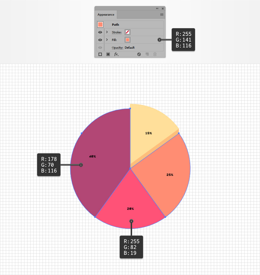
Remove the existing stroke color and then select the fill. Set its color to R=255 G=190 B=123 and go to Effect > Distort & Transform > Transform. Drag the Move-Vertical slider to -1 px and enter 15 in the Copies box, and then click OK. Return to the Appearance panel and add a second fill using the Add New Fill button. Select it, set the color to R=255 G=223 B=153, and go to Effect > Distort & Transform > Transform. Drag the Move-Vertical slider to -15 px and click OK.

direct selection tool

Step 2

Using the Direct Selection Tool (A), select the other pie chart slices one by one. Remove the stroke color and replace the existing fill colors with the ones shown below.

change color

Step 3

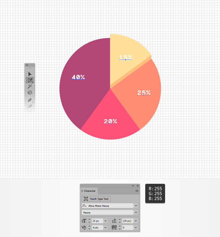
Pick the Group Selection Tool and select one of the text pieces from your pie chart. Click a second time on the same piece of text to easily select all the text.

Open the Character panel (Window > Type > Character) and select the Alma Mono Heavy font. Set the Size to 25 px and change the color to white (R=255 G=255 B=255).

edit text

3. How to Stylize Your Pie Chart

Step 1

Pick the Move Tool (V), select your entire pie chart, and focus on the Appearance panel.

Add a new fill, select it, and make sure that it lies below the “Contents” section. Set the color to R=255 G=242 B=236 and go to Effect > Convert to Shape > Ellipse. Check the Absolute box, set both Width and Height to 500 px, click OK, and then go to Effect > Distort & Transform > Transform. Drag the Move-Vertical slider to 7 px, click OK, and go to Effect > Stylize > Drop Shadow. Enter the attributes shown below and click OK.

add new fill

Step 2

Make sure that your entire pie chart is still selected and keep focusing on the Appearance panel. Add a second fill, drag it below the existing fill, and select it.

Set the color to R=255 G=82 B=119, lower its Opacity to 30%, and go to Effect > Convert to Shape > Ellipse. Check the Absolute box, set both Width and Height to 440 px, click OK, and then go to Effect > Distort & Transform > Transform. Drag the Move-Vertical slider to 45 px, click OK, and go to Effect > Blur > Gaussian Blur. Enter a 15 px Radius and click OK.

gaussian blur

Step 3

Make sure that your entire pie chart is still selected and keep focusing on the Appearance panel. Add a third fill, drag it above the other two fills, and select it.

Set the color to R=255 G=82 B=119, lower its Opacity to 50%, and go to Effect > Convert to Shape > Ellipse. Check the Absolute box, set both Width and Height to 350 px, click OK, and then go to Effect > Distort & Transform > Transform. Drag the Move-Vertical slider to 35 px, click OK, and go to Effect > Blur > Gaussian Blur. Enter a 15 px Radius and click OK.

chart shadow

4. How to Create a Simple Legend

Step 1

Using the Rectangle Tool (M), create a 510 x 80 px shape, and place it as shown in the following image. Make sure that this rectangle stays selected and focus on the Appearance panel.

Select the fill, set its color to R=255 G=242 B=236, and go to Effect > Stylize > Rounded Corners. Enter a 40 px Radius, click OK, and go to Effect > Stylize > Drop Shadow. Enter the attributes shown below and click OK.

rounded rectangle

Step 2

Make sure that your rectangle stays selected and keep focusing on the Appearance panel. Add a second fill and drag it below the other one.

Set the color to R=255 G=82 B=119, lower its Opacity to 30%, and go to Effect > Stylize > Rounded Corners. Enter a 10 px Radius, click OK, and go to Effect > Distort & Transform > Transform. Enter the attributes shown below, click OK, and go to Effect > Blur > Gaussian Blur. Set the Radius to 15 px and click OK.

legend shadow

Step 3

For this step, you will need a grid every 5 px. Simply go to Edit > Preferences > Guides & Grid and enter 5 in the Gridline every box.

Pick the Ellipse Tool (L) and create a 60 px circle, and then select the Rectangle Tool (M) and create a 30 px square. Place your square as shown in the second image and fill it with R=255 G=190 B=123. Select both shapes made in this step and click the Intersect button from the Pathfinder panel (Window > Pathfinder).

pathfinder panel

Step 4

Select your quarter circle and place it as shown in the following image.

quarter circle

Step 5

Make three copies of your quarter circle. Place them as shown below and replace the yellow with the colors shown below.

change color

Step 6

Go to your Toolbar and set the fill color to R=178 G=70 B=116. Focus on the Character panel, select the Auro font, and set the size to 16 px.

Pick the Type Tool (T), click on your artboard, add the “Lemon” piece of text, and then place it as shown below. Type the other three pieces of text and place them as shown below.

type tool

Step 7

Select all four pieces of text and go to Effect > Stylize > Drop Shadow. Enter the attributes shown below and click OK.

drop shadow

5. How to Create a Simple Background

Pick the Rectangle Tool (M) and create an 870 x 1000 px shape. Fill this new rectangle with R=255 G=255 B=250, make sure that it covers your entire artboard, and send it to back (Shift-Control-[).

background

Congratulations! You’re Done!

Here is how it should look. I hope you’ve enjoyed this tutorial and can apply these techniques in your future projects. Don’t hesitate to share your final result in the comments section.

Feel free to adjust the final design and make it your own. You can find some great sources of inspiration at GraphicRiver, with interesting solutions to improve your design.

final product

How to Create an Editable Line Chart in Adobe Illustrator

Final product image
What You’ll Be Creating

In the following steps, you will learn how to create a fully editable line chart in Adobe Illustrator and how to easily adjust its style.

First, you will learn how to create the starting line chart using the Line Graph Tool. Using the Group Selection Tool and the Graphic Styles panel along with some basic colors and effects, you will learn how to stylize the main components of your chart. Taking full advantage of the Appearance panel, you will learn how to add a frame to your chart and how to apply subtle shading and highlights. Finally, you will learn how to easily adjust the data on your chart.

For more inspiration on how to adjust or improve your final chart, you can find plenty of resources at GraphicRiver.

What You Will Need

You will need the following in order to complete this project:

1. How to Create a New Document and Set Up the Starting Chart

Step 1

Hit Control-N to create a new document. Select Pixels from the Units drop-down menu, enter 850 in the width box and 665 in the height box, and then click that More Settings button. Select RGB for the Color Mode, set the Raster Effects to Screen (72 ppi), and then click Create Document.

Don’t forget to set the unit of measurement to pixels from Edit > Preferences > Units. All these options will significantly increase your work speed.

new document

Step 2

Focus on your toolbar and double click the Line Graph Tool to open the Graph Type window. Enter the attributes shown in the following image and then click OK.

graph type

Step 3

Make sure that the Line Graph Tool is selected and simply click on your artboard to open the Graph window. Set both Width and Height to 350 pt, and then click OK.

Enter the data shown below and then click that Check button. Your graph should look roughly as shown in the following image.

line graph tool

2. How to Adjust the Text on the Chart

Step 1

Pick the Group Selection Tool and focus on the column of text from your chart design. Click once on one of those pieces of text to select it, and then click a second time on the same text to select all the text from that column. You can use the Group Selection Tool to easily select multiple elements with similar attributes from your graph.

Make sure that these pieces of text remain selected and open the Character panel (Window > Type > Character). Select the Krona One font, set the size to 15 px, and change the text color to R=81 G=90 B=95.

adjust text

Step 2

Using that same Group Selection Tool, select the numbers from your chart. Focus on the Character panel, change the font to Krona One font, and set the size to 12 px and the text color to R=81 G=90 B=95.

group selection tool

3. How to Adjust the Line Separators on the Chart

Step 1

Focus on the bottom side of your graph and pick the Group Selection Tool. Select all horizontal and vertical paths (highlighted in the first image), go to the Appearance panel, and simply remove the existing stroke color. This should basically make your selected paths invisible.

invisible stroke

Step 2

Focus on the left side of your graph, select that long, vertical path, and remove its stroke color.

horizontal path

Step 3

Using the Group Selection Tool, select the tiny horizontal paths from your chart (highlighted in the first image). Focus on the Appearance panel, set the stroke color to R=81 G=90 B=95, and then open the Stroke fly-out panel. Make sure that the Weight is set to 1 px and check the Round Cap button.

Keep focusing on the Appearance panel and add a second stroke using the Add New Stroke button. Select the bottom stroke from the panel, lower its Opacity to 20%, and then go to Effect > Distort & Transform > Transform. Enter the settings shown below and click OK.

add new stroke

Step 4

Make sure that your tiny horizontal paths are still selected and keep focusing on the Appearance panel. Add a new stroke, drag it below the other two strokes, and select it.

Change the color to black (R=0 G=0 B=0), lower its Opacity to 20%, and go to Effect > Distort & Transform > Transform. Enter the settings shown below (in the left window), click OK, and go again to Effect > Distort & Transform > Transform. Enter the settings shown below (in the right window) and click OK.

transform effect

Step 5

Select only the bottom tiny path and focus on the Appearance panel. Remove the top and bottom strokes, select the remaining stroke, and increase the Opacity to 100%.

delete stroke

4. How to Add a Frame to Your Chart

Step 1

Pick the Move Tool (V) and select your entire graph. Focus on the Appearance panel and use the Add New Fill button to add a new fill.

Make sure that the fill lies below the Contents section and select it. Set the color to R=30 G=38 B=41 and go to Effects > Convert to Shape > Rectangle. Enter the settings shown below, click OK, and go to Effect > Stylize > Rounded Corners. Set the Radius to 20 px, click OK, and go to Effect > Distort & Transform > Transform. Enter the attributes shown in the following image, click OK, and go to Effect > Stylize > Drop Shadow. Enter the settings shown below and click OK.

frame

Step 2

Make sure that your entire graph is still selected and keep focusing on the Appearance panel. Add a second fill and drag it below the existing one.

Select this new fill, lower its Opacity to 70%, change the color to black, and go to Effect > Convert to Shape > Rectangle. Enter the settings shown below, click OK, and go to Effect > Stylize > Rounded Corners. Set the Radius to 20 px, click OK, and go to Effect > Distort & Transform > Transform. Enter the attributes shown in the following image, click OK, and go to Effect > Blur > Gaussian Blur. Set the Radius to 15 px and click OK.

gaussian blur

5. How to Stylize the First Line on the Chart

Step 1

Pick the Group Selection Tool and select the five segments that make up the top line of your line chart. Focus on the Appearance panel and select the stroke. Change the color to R=246 G=178 B=33 and make sure that the Weight is set to 2 px.

yellow line

Step 2

Focus on your yellow line and select one of the black squares that indicate the end point of a line segment. Focus on the Appearance panel, remove the stroke color, and change the fill color to R=246 G=178 B=33.

yellow square

Step 3

Make sure that your yellow square stays selected and keep focusing on the Appearance panel. Select the entire path (simply click that Path section from the Appearance panel) and go to Effect > Path > Offset Path. Enter a 2 px Offset, click OK, and go to Effect > Stylize > Rounded Corners. Enter a 5 px Radius and click OK.

rounded corners

Step 4

Make sure that your yellow square is still selected and keep focusing on the Appearance panel.

Add a second fill and select it. Change its blending mode to Soft Light and apply the linear gradient shown below.

linear gradient

Step 5

Make sure that your yellow square is still selected and keep focusing on the Appearance panel.

Add a third fill and select it. Set the color to R=30 G=38 B=41 and go to Effects > Path > Offset Path. Enter a -3 px Offset, click OK, and go to Effect > Stylize > Drop Shadow. Enter the attributes shown below and click OK.

offset path

Step 6

Make sure that your yellow square is still selected and keep focusing on the Appearance panel.

Drag the stroke below the existing fills and select it. Set the color to R=30 G=38 B=41 and open the Stoke fly-out panel. Change the Weight to 2 px and check the Align Stroke to Outside button.

align stroke

Step 7

Make sure that your yellow square is still selected and keep focusing on the Appearance panel. Select the yellow fill and apply the two Drop Shadow effects shown below, starting with the left one.

drop shadow

Step 8

Make sure that your yellow square is still selected, open the Graphic Styles panel, and click the New Graphic Style button.

graphic style

Step 9

Pick the Group Selection Tool and select the other black squares that go along your yellow line. Once selected, simply apply your style from the Graphic Styles panel.

apply graphic style

Step 10

Focus on the bottom row of your legend and select that horizontal path. Change the stroke color to R=246 G=178 B=33, increase the Weight to 2 px, and don’t forget to check the Round Cap button from the Stroke fly-out panel.

Move to the black square, select it, and simply apply your graphic style from the Graphic Styles panel.

legend

6. How to Stylize the Other Lines on the Chart

Step 1

Move down to the next line from your line chart. Use the Group Selection Tool to select all segments of this line and change the stroke color to R=255 G=118 B=4.

Select the black squares that go along the orange line and apply your graphic style. Make sure that all these shapes remain selected and focus on the Appearance panel. Select the yellow fill and replace that color with R=255 G=188 B=4.

orange line

Step 2

Move down to the next line from your line chart. Use the Group Selection Tool to select all segments of this line and change the stroke color to R=190 G=74 B=124.

Select the black squares that go along the purple line and apply your graphic style. Make sure that all these shapes remain selected and focus on the Appearance panel. Select the yellow fill and replace that color with R=190 G=74 B=124.

purple line

Step 3

Move down to the next line from your line chart. Use the Group Selection Tool to select all segments of this line and change the stroke color to R=40 G=118 B=221.

Select the black squares that go along the blue line and apply your graphic style. Make sure that all these shapes remain selected and focus on the Appearance panel. Select the yellow fill and replace that color with R=30 G=118 B=221.

blue line

Step 4

Move down to the next line from your line chart. Use the Group Selection Tool to select all segments of this line and change the stroke color to R=0 G=165 B=0.

Select the black squares that go along the green line and apply your graphic style. Make sure that all these shapes remain selected and focus on the Appearance panel. Select the yellow fill and replace that color with R=0 G=165 B=0.

green line

7. How to Add a Background and Edit the Chart

Step 1

Pick the Rectangle Tool (M) and create an 870 x 685 px shape. Fill this rectangle with R=81 G=90 B=95, send it to back (Shift-Control-[) and make sure that it covers your entire canvas.

background

Step 2

Finally, remember that you can always edit the data from your chart, and your design will not change.

Here’s how you can easily do it: Make sure that your chart is selected, right click anywhere on your artboard, and go to Data. Adjust your data and then click that check button.

edit chart

Congratulations! You’re Done!

Here is how it should look. I hope you’ve enjoyed this tutorial and can apply these techniques in your future projects. Don’t hesitate to share your final result in the comments section.

Feel free to adjust the final design and make it your own. You can find some great sources of inspiration at GraphicRiver, with interesting solutions to improve your design.

final product

How to Create Mesh Leaves and a Wooden Sign in Adobe Illustrator

Final product image
What You’ll Be Creating

In this tutorial, you will learn how to use the Mesh Tool in Adobe Illustrator to create a natural summer background.

If you want to skip the tutorial and just use this vector in your work, purchase Natural Background with Leaves and a Wooden Sign from GraphicRiver!

Natural Background with Leaves and a Wooden Sign

1. How to Draw the Paper and the Board

Step 1

Let’s begin drawing the paper with Mesh!

Grab the Mesh Tool (U) and a white rectangle. Click inside the rectangle to create a Mesh grid, and then color the lower and right edges of the paper with #DDDDDD.

Bend the upper left corner of the paper, and then color it with #B8B8B8. Finish by changing a node to #CBCBCB.

draw a paper with mesh

Step 2

Create a shape of a bent corner, filling it with a Linear Gradient from #000000 to #E3E3E3 to #FFFFFF.

linear gradient

Step 3

Attach the corner to the paper.

paper note vector

Step 4

Begin making a blend by creating two shapes like shown below, the bigger one white and the smaller black.

Place the black shape inside the white shape.

blend adobe illustrator

Step 5

Make the white shape transparent, and then proceed to Object > Blend > Blend Options. Set it to Specified Steps, 30.

Finally, select both objects and finish with Object > Blend > Make.

blend shadow tutorial

Step 6

Add the blend under the paper. You can also learn how to create a nail in this tutorial.

nail vector note

Step 7

Let’s begin by taking a wooden vector texture! You can find out how to make one right here.

If you end up using the texture from my tutorial, begin by adjusting the color of the wood with Edit > Edit Colors > Saturate with a value of -67%.

wooden texture tutorial vector

Step 8

Create a gradient overlay for the planks. Use a Radial Gradient from #BFB3AB to #0C0503, and set the object to Overlay.

gradient

Step 9

Pick five planks out of the texture (preferably the ones pictured below and in the same order), and then place the overlay on top of each.

vector mesh wooden plank

Step 10

Draw an outline of a plank as shown below, and then create a copy of it.

Use the original to make a clipping mask with the textured plank. Fill the copy with #82614A, and then go to Effect > 3D > Extrude and Bevel.

Input the options shown below, and expand the result with Object > Expand Appearance.

adobe illustrator 3d effect

Step 11

Place the texture on top of the object.

textured vector plank

Step 12

Use the same outline and 3D object for the second textured plank.

textured vector plank

Step 13

Draw a new outline for the fourth and third planks, and then repeat the process of Steps 10-12.

vector wood tutorial
vector wooden plank

Step 14

Create one final outline and 3D object for plank 5.

3d effect tutorial

Step 15

Assemble the sign as shown below and rotate it slightly.

wooden sign vector

Step 16

Take planks 1 and 4, create copies of them, and stretch them out.

sign vector

Step 17

Add those behind the sign.

add legs to the sign

Step 18

Add the paper on top of the sign.

add paper to the sign

2. How to Draw the Ladybug

Step 1

Begin by drawing the body of the bug with Mesh.

You will need these colors:

  1. #CE2606
  2. #DF925E
  3. #E5C5A6
  4. #DA896A
mesh ladybug

Step 2

Finish the Mesh drawing.

  1. #F3F8F6
  2. #900903
  3. #3C0000
  4. #7D0000
  5. #650400
gradient mesh ladybug tutorial

Step 3

Create a rectangle filled with #BD4117, and bend it with Arc and Expand Appearance.

bend with arc

Step 4

Color the object with Mesh.

  1. #B21F03
  2. #A03C1B
  3. #D55A44
  4. #570805
mesh ladybug wing

Step 5

Finish the wing.

  1. #F5F7F8
  2. #A01301
  3. #880800
mesh ladybug wing

Step 6

Bend a #B74016 rectangle.

tutorial mesh bug

Step 7

Color it with Mesh.

  1. #400000
  2. #272522
mesh wing of ladybug

Step 8

Draw the head of the ladybug.

  1. #1B1D20
  2. #E3DCB2
  3. #EEE6DA
  4. #797776
mesh head bug

Step 9

Draw another part of the head.

  1. #282828
  2. #4F4F4F
  3. #000000
  4. #CBCBCB
ladybug vector tutorial

Step 10

Draw legs.

  1. #2E2E2E
  2. #686868
ladybug leg vector tutorial

Step 11

Draw the antennae.

  1. #010101
  2. #720500
antennae ladybug

Step 12

Draw spots.

  1. #000000
  2. #4F4F4F
  3. #FFFFFF
spot ladybug

Step 13

Change the Transparency of the spot, and then create a few copies and modify them with Effect > Bend.

multiply
squezze
inflate

Step 14

Assemble the ladybug.

assemble ladybug vector

Step 15

Create a Blend shadow out of #162304 and #D5DBCC ellipses.

blend shadow

3. How to Draw the Background

Step 1

Begin by drawing a simple mesh object using #FFFFFF and #A5DDED.

sky background

Step 2

If you’d like to draw the leaves and the branch, consult this tutorial.

Then recolor the leaves with Edit > Edit Colors > Adjust Colors and 5% Red.

vector leaves

Step 3

Recolor some of the individual leaves using the same method. You can also make some of them more transparent.

recolor leaf
transparent leaf

Step 4

Arrange some leaves inside an outline for a Clipping Mask.

clipping mask

Step 5

Take the grass from this tutorial.

Then isolate one of the blades and bend it with Effect > Warp > Arc.

vector grass

Step 6

Set the ladybug on top of the bent blade of grass.

blade of grass with ladybug

Step 7

Place it in the middle of the grass patch.

grass vector

Step 8

Create circles, different in size and filled with #B4B4B4. Set them to Overlay.

highlights

Step 9

Add more sizes and varying Opacity.

vector highlights

Step 10

Draw the sun using a Radial Gradient from #FFFFFF to #FFB500 to #000000.

Set the Transparency to Screen.

vector sun

Step 11

Assemble the background out of all the elements, and you’re done!

nature background adobe illustrator

Awesome Work, You’re Now Done!

What now? You can try any of my other tutorials from my profile or check out my portfolio on GraphicRiver, as well as the original vector we recreated in this tutorial.

I hope you enjoyed the tutorial, and I would be super happy to see any results in the comments below.

Natural Background with Leaves and a Wooden Sign

How to Create a Memphis Style Club Poster in Adobe InDesign

Final product image
What You’ll Be Creating

Looking for an eye-catching poster style to promote a club night, festival, or music gig? This Memphis-inspired design is quick to create in InDesign and has a stylish, on-trend look that would work for any event.

If you’re a relative beginner to InDesign, this tutorial is a great introduction to a range of print design techniques. It’s also super easy to customise the design to your own text and color scheme.

If you’re on the hunt for more poster designs, a poster template is a quick and easy-to-edit alternative. You can find tons of awesome music and club posters over on GraphicRiver and Envato Elements.

Let’s get started!

What You’ll Need to Create Your Poster

As well as access to Adobe InDesign, you’ll also need to use vector software, such as Adobe Illustrator, to edit the pattern graphics. 

You’ll also need to download the following pattern and font files from Elements:

Install the fonts on your computer, and you’re ready to start designing your poster.

1. How to Create Your Poster Document in InDesign

Step 1

Open InDesign and go to File > New > Document. 

Set the intent to Print, and the Units to Inches. Set the Width of the page to 24 in and Height to 36 in, and uncheck the Facing Pages box. 

Set the Top and Bottom Margins to 5.4375 in, and the Right and Left Margins to 4.25 in. Add a Bleed of 0.5 in, before clicking Create

new document

Step 2

Expand the Layers panel (Window > Layers) and double-click on the Layer 1 name. Rename this Background Color and click OK

Create two more new layers, first Memphis Pattern and then Type. Lock both of these, leaving Background Color unlocked and active. 

layers panel

Step 3

Expand the Swatches panel (Window > Color > Swatches) and choose New Color Swatch from the panel’s top-right drop-down menu. 

With the Type set to Process and Mode to CMYK, set the levels below to C=0 M=94 Y=17 K=0. Click Add and Done

Repeat the process to create four more new CMYK swatches:

  • C=2 M=19 Y=83 K=0
  • C=75 M=1 Y=40 K=0
  • C=0 M=51 Y=0 K=0
  • C=83 M=45 Y=2 K=0
swatch options

Step 4

Select the Rectangle Tool (M) and drag across the whole page, extending it up to the edge of the bleed on all sides.

From the Swatches panel, set the Fill of the shape to your yellow swatch, C=2 M=19 Y=83 K=0.

yellow shape

2. How to Format Typography on Your Poster

Step 1

Lock the Background Color layer and unlock the top layer, Type

Use the Rectangle Tool (M) to create a shape that extends up to the margin lines. Set the Fill Color to [Black] and Stroke Color to [Paper].

Expand the Stroke panel (Window > Stroke) and increase the Weight of the shape’s outside stroke to 61 pt. 

black shape

Step 2

Switch to the Type Tool (T) and drag to create a text frame across the top of the black shape. 

Type in ‘LAUNCH NIGHT’ (or your own intro text), and from either the top Controls panel or the Character panel (Window > Type & Tables > Character), set the Font to Bw Modelica Bold, Font Size to 82 pt, and Tracking (letter-spacing) to 130. 

Adjust the Font Color to [Paper].

launch night text

Step 3

Create a second larger text frame below, typing in the main title of the event and setting the Font to Bw Modelica Black. Size the text to allow it to fill up most of the black shape, and use hyphenation to break up longer words across lines. 

header text

Set each word of the title in one of your new swatches.

color applied

Step 4

Create a break between the two text frames by creating a short horizontal line using the Line Tool ().

Set the Stroke Color to [Paper] and increase the Weight to 35 pt from the Stroke panel. 

line stroke

Copy and Paste the line, moving the second below the main title. 

line below

Step 5

Add the day of the event to the bottom of the black shape, setting the Font to Bw Modelica Bold, Size 69 pt, and setting the ‘TH’ of the date to Superscript (which you can find to the right of the Font Size menu on the top Controls panel).

superscript date

Add the month and year of the event next to this, set in Bw Modelica, Size 81 pt. 

date in modelica

Step 6

Select the black rectangle shape, and go to Object > Effects > Drop Shadow. 

Click on the colored square to the right of the Mode menu, and switch the Effect Color to C=0 M=94 Y=17 K=0. Click OK.

Back in the Drop Shadow options, bring the Opacity down to around 60%, and increase the Size to 0.725 in, Spread to 40%, and Noise to about 25%

Then click OK to exit the window. 

effect color

Step 7

Once you’re completely happy with the formatting of the text on your poster, you can vectorise the main header, which will allow you to fill it with a decorative vector pattern.

Select the title text frame and go to Type > Create Outlines. 

create outlines
outlined text

Step 8

Minimize the InDesign window for now, and open up the ‘simplechic_hellomart-14.eps’ vector file from the patterns pack in Illustrator

patterns pack

Switch the Fill Color of the pattern to white, and then select the whole pattern and Edit > Copy it. 

white waves

Head back to your InDesign document, select only the first line of the main title, and Edit > Paste Into the pattern. 

waves pattern

If the same word continues over onto the next line, repeat the same pattern inside this as well. 

waves pattern

Step 9

Open the ‘simplechic_hellomart-02.eps’ file in Illustrator, and switch the Fill Color to white, as before. Edit > Copy, as before also. 

dots pattern

Head back to the InDesign document, and Edit > Paste Into the next word of the title.

dots inside

Use the ‘simplechic_hellomart-13.eps’ file to fill up any remaining text on your title. First, as before, open it in Illustrator, adjust to a white color, and then copy and paste it inside the text outline. 

stripe pattern
stripes inside

3. How to Add a Memphis Pattern to Your Poster

Step 1

Open up the ‘simplechic_hellomart-04.eps’ file in Illustrator.

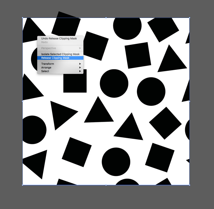
Right-Click on one of the shapes overlapping the edge of the artboard, and Right-Click > Release Clipping Mask, to be able to see the whole shape.  

release clipping mask

Repeat the process, working your way around the whole edge, until all the shapes are visible. 

release clipping mask

When you’re done, select all the shapes on the artboard and Edit > Copy. 

release clipping mask

Step 2

Head back to your InDesign document and lock the Type layer. Unlock the Memphis Pattern layer.

Edit > Paste to drop the vector pattern directly onto the page. Scale so that it fills roughly a quarter of the page. 

pasted pattern

Give the shapes a [Black] Stroke Color, increasing the Weight of the Stroke to 12 pt. 

stroke

Select each shape individually and adjust the Fill Color to one of your color swatches. 

colored pattern

Step 3

For some of the shapes, select them individually and File > Place, dropping in one of the unedited pattern EPS files, to add a bit of texture and interest. 

pattern placed
pattern inside

Step 4

Copy and Paste the whole section of pattern, moving it over to another section of the page, and rotating it to fit.

pasted pattern

Repeatedly paste sections of pattern, until you’ve filled up the whole background.

pattern section
pattern

4. How to Export Your Poster for Printing

Your poster artwork is finished—nice work! Now all that’s left to do is to export it to a format that’s press-ready. 

Step 1

Go to File > Export. 

Name your file, and choose Adobe PDF (Print) from the Format drop-down menu at the bottom of the window. 

Click Save

In the Export Adobe PDF window that opens, choose [Press Quality] from the Adobe PDF Preset menu at the top of the window.

press quality

Step 2

Click on Marks and Bleeds in the window’s left-hand menu. 

Check both All Printer’s Marks and Use Document Bleed Settings, before clicking Export

marks and bleeds
pdf exported

Conclusion: Your Finished Poster

Your Memphis Style poster is finished—great job!

In this tutorial, we’ve covered a wide range of skills for creating print designs. You now know how to:

  • Create an 80s-inspired color palette for your poster designs.
  • Format professional typography for your layouts.
  • Import and format vector patterns to create interest and texture in your designs.

If you’re on the hunt for more poster designs, a poster template is a quick and easy-to-edit alternative. Track down more great club and music event flyers on GraphicRiver and Envato Elements.

final poster

How to Create a Scary Cellar Illustration in Adobe Illustrator

Final product image
What You’ll Be Creating

Welcome back to
another Illustrator tutorial in which we’re going to learn how to put together
a scary cellar scene, using some basic geometric shapes and tools that you
probably already work with on a daily basis.

Oh, and don’t forget you can always expand the composition by heading over to GraphicRiver where you’ll find a great selection of vector assets.

So, assuming you already have the software up and running, grab a quick
sip of that fresh coffee and let’s get started!

1. How to Set Up a New Project File

As always, we’re going to kick things off
by setting up a new project file by heading over to File > New (or using the Control-N
keyboard shortcut), and then adjusting it as follows:

  • Number
    of Artboards:
    1
  • Width:
    800
    px
  • Height:
    600
    px
  • Units:
    Pixels

And from the Advanced tab:

  • Color
    Mode:
    RGB
  • Raster
    Effects:
    Screen (72ppi)
  • Preview Mode: Default
how to set up a new document

2. How to Set Up the Layers

Once we’ve finished setting up our project
file, it would be a good idea to structure our document using a couple of
layers, since this way we can maintain a steady workflow by focusing on one
section of the illustration at a time.

That being said, bring up the Layers panel, and create a total of three
layers, which we will rename as follows:

  • layer
    1:
    background
  • layer
    2:
    floor
  • layer 3: trap door
how to set up the layers

Quick tip: I’ve colored all of
my layers using the same green value, since it’s the easiest one to view when
used to highlight your selected shapes (whether they’re closed or open paths).

3. How to Create the Background

As soon as we’ve layered our document, we
can start working on the actual illustration, and we will do so by creating the
background. That being said, make sure you’ve positioned yourself onto the
first layer and let’s jump straight into it!

Step 1

Grab the Rectangle Tool (M) and create an 800 x 600 px rectangle, which we will
color using #21353A and then position to the center of the underlying Artboard
using the Align panel’s Horizontal and Vertical Align Center
options.

creating and positioning the main background shape

Step 2

Once we have the background in place, we can lock the current layer and then
move on to the next one (that would be the second one), where we will focus on
the second part of our composition.

locking the background layer

4. How to Create
the Floor

Assuming you’ve
already positioned yourself onto the second layer, let’s continue working on our
composition by creating the floor section.

Step 1 

Create the main shape for the lighted section of the floor using a 480 x 320 px rectangle which we will
color using #FFB85A, and then center align to the Artboard’s bottom edge.

creating and positioning the main shape for the lighted floor

Step 2

Adjust the shape that we’ve just created by individually selecting its
bottom anchor points using the Direct
Selection Tool
(A) and then
pushing them to the inside by a distance of 128 px using the Move tool
(right click > Transform > Move
> Horizontal > +/- 128 px
depending on which side you start with).

adjusting the shape for the lighted floor

Step 3

Continue adjusting the shape by adding a new
anchor point to the center of its top edge using the Add Anchor Point Tool (+), which we will then push to the outside
by 160 px (right click > Transform > Move > Vertical > -160
px
).

adjusting the upper section of the lighted floor

Step 4

Give the upper section of the resulting shape a curvature by converting
its top anchor to smooth using the Convert
selected anchor points to smooth
tool, and then repositioning its handles
at a distance of 184 px from its
center as seen in the reference image.

adjusting the curvature of the lighted floor

Step 5

Create a copy (Control-C) of
the shape that we’ve just finished adjusting, which we will paste in front (Control-F) and then turn into a linear
gradient with a 90º Angle. Use #F75443
for both of its color stops, lowering the Opacity
of its left one to 0% and its right
one to 60%. Once you’re done, make
sure to select and group both the gradient and the floor’s main shape together
using the Control-G keyboard
shortcut before moving on to the next one.

adding the gradient to the floor

Step 6

Next, we’re going to start adding the floor lines which will help build
the perspective, and we will do so by creating the center line using an 8 x 600 px rectangle (#21353A), which we
will center align to the larger Artboard.

creating and positioning the center floor line

Step 7

Add the remaining lines using four copies (Control-C > Control-F four times) of the one that we’ve just
created, which we will then individually adjust by repositioning their bottom
anchor points 184 px from
one another as seen in the reference image (right click > Transform > Move > Horizontal > +/- 184 px depending
on which side you start with). Take your time, and once you’re done, select and
group (Control-G) all five of them
together before moving on to the next step.

adding the remaining floor lines

Step 8

Give the resulting lines a set of highlights by creating a copy (Control-C) of them which we will paste
in back (Control-B). Then adjust them by setting their color to #FFCD5C and then individually increasing their Width by 4 px on each side. Once you’re done,
don’t forget to select both the highlights and ground lines and group them
together using the Control-G
keyboard shortcut.

adding the highlights to the floor lines

Step 9

Grab the Pen Tool (P), and
quickly draw the little cracks into the floor, coloring the darker shapes using
#21353A and their highlights using #FFCD5C. Take your time, and once you’re
done, make sure you select and group all of them together using the Control-G keyboard shortcut.

adding the cracks to the floor

Step 10

Since we want the floor lines and the cracks to remain confined to the
lighted surface, we’re going to mask them using a copy (Control-C) of the larger underlying shape, which we will paste in
front (Control-F) and then, with both
the desired shapes and the copy selected, simply right click > Make Clipping Mask.

masking the details of the floor

Quick tip: for the moment, we’re going to be moving on to
the next section, but we’ll be adding a few more cracks and some highlights once we’ve finished
working on the cellar’s entrance.

5. How to Create
the Cellar Entrance

Since we’re pretty
much done working on the floor, we can lock its layer and move on up to the
next one (that would be the third one) where we will start working on the
center piece of our composition.

Step 1

Create the main shape for the cellar’s entrance using a 244 x 128 px rectangle (#21353A), which
we will adjust by individually selecting and pushing its top anchor points to
the inside by 40 px (right click > Transform > Move >
Horizontal > +/- 40 px
depending on which side you start with). As soon
as you’re done, center align the resulting shape to the underlying Artboard,
positioning it 120 px
from the floor’s top edge.

creating and positioning the main shape for the cellar entrance

Step 2 

Start working on the support beam by creating the main shape for its
upper section using a 244 x 36 px rectangle, which we will color using #AA5D3F and then position on top of the previous
shape as seen in the reference image.

creating the upper support beam

Step 3

Add the hinges using two 16 x 8 px rectangles (#21353A) stacked on top of an 8 x 16 px rectangle (#21353A), which we
will individually group (Control-G)
and then position 84 px from
one another, making sure to align them to the top edge of the beam.

adding the hinges to the top support beam

Step 4

As we did with the floor, we’re going to take a couple of moments and draw in the little cracks (#21353A), highlights (#D67C50), and top shadow (#21353A), making sure to select and group
all of them together using the Control-G
keyboard shortcut. Take your time, and once you’re done, don’t forget to select
and group (Control-G) all of the
current section’s composing shapes before moving on to the next one.

adding details to the top support beam

Step 5

Create the vertical support beams using two 24 x 92 px rectangles, which we will color using #844438 and then
position on the sides of the top one as seen in the reference image.

adding the side support beams

Step 6

Give the shapes that we’ve just created some details by drawing in the
little cracks (#21353A), highlights (#AA5D3F), and shadows (#21353A), making
sure to select and group (Control-G)
all of them together, doing the same for each beam afterwards.

adding details to the vertical support beams

Step 7

Select and group (Control-G)
all three support beams together, masking them afterwards using a copy (Control-C > Control-F) of the
underlying shape (desired shapes selected >
right click > Make Clipping Mask
). Once you’re done, select and group (Control-G) all of the cellar entrance’s
composing shapes together before moving on to the next step.

masking the cellar entrance

Step 8

Create the trap door using a copy (Control-C
> Control-F
) of the cellar entrance’s main shape, which we will adjust
by first changing its color to #FFA95C and then vertically reflecting (right click > Transform > Reflect
> Vertical
) and positioning it above as seen in the reference image.

creating and positioning the main shape for the trap door

Step 9

Add the door’s upper section using a 244 x 12 px rectangle (#844438), which we will adjust by
individually selecting and pushing its top anchor points to the inside by 12 px (right click > Transform > Move >
Horizontal > +/- 12 px
depending on which side you start with),
positioning the resulting shape on top of the previously created shape.

adding the upper section to the trap door

Step 10

Create the top highlight using a 244
x 2 px
rectangle, which we will color using #FFCD5C and then center align to
the door’s top edge, making sure to mask it afterwards.

adding the subtle highlight to the upper section of the trap door

Step 11

Next, grab the Pen Tool (P)
and quickly add some details to the lower section of the door by drawing the
cracks (#21353A) and subtle highlights (#21353A), using the reference image as
your main guide. Take your time, and once you’re done, make sure you select and
group all of the resulting shapes together using the Control-G keyboard shortcut.

adding details to the lower section of the trap door

Step 12

Start working on the occult symbol by creating the outer circle using a 72 x 72 px circle with a 4 px thick Stroke (#21353A), which we will horizontally center align to the
larger door, positioning it 28 px from its top edge.

creating the outer circle for the occult symbol

Step 13

Following the reference image as your main guide, draw the downward-facing
pentagram using a 4 px thick Stroke (#21353A), making sure that its
anchor points overlap the path of the larger circle. Once you’re done, select
and group (Control-G) the two together
before moving on to the next step.

drawing the pentagram

Step 14

Since we want the symbol to look hand-drawn, we’re going to
apply a subtle roughen effect to its composing shapes, by heading over to Effect > Distort & Transform >
Roughen
 and setting the Size to 1 px (Absolute) and the Detail to 15 / in,
making sure to set the Points to Corner.

applying a roughen effect to the occult symbol

Step 15

Next, we’re going to be adding to the darkness of the scene by drawing
the blood splatter using one of Illustrator’s
default brushes called Ink Splatter,
which can be found within the Brushes
panel’s Library under Artistic > Artistic Ink. Once you
have it selected, simply switch over to the Paintbrush
Tool (B)
and, with the Stroke
color set to #C63E2C, click anywhere on the trap door in order to create the splatter.

drawing the blood splatter

Step 16

Since we want to be able to edit the splatter, we’re going to expand it
by heading over to Object > Expand
Appearance
, which will turn our brush stroke into a set of objects. This is
the tricky part since, in order to set the splatter’s Opacity to 100%, you’ll
have to isolate the resulting shapes by double-clicking on them, and then
select the outer rectangular frame (which is invisible) and remove it by
pressing Delete. Then you should be
able to set the Opacity level to the
upper limit and resize and position the splatter as seen in the reference
image. Also, since we’re done working on the trap door, you can select and
group (Control-G) all its composing
shapes before moving on to the next step.

adjusting the blood splatter

Step 17

Since we’re pretty much done working on the cellar entrance, we can go
back to the second layer, and add the subtle horizontal highlight using a 244 x 4 px rectangle (#FFCD5C) followed
by a few cracks (#21353A) and smaller highlights (#FFCD5C), which we will
position inside the Clipping Mask
that we’ve created for the other details.

adding the final cracks and highlights to the floor

6. How to Create
the Spooky Eyes

Position yourself
back on the third and last layer, and let’s finish the composition by adding the
spooky staring eyes.

Step 1

Start by creating the main shapes for the center pair of eyes using two 8 x 8 px circles (#F2673D), on top of
which we will add a smaller 4 x 4 px one
(#21353A), individually grouping (Control-G)
and positioning them on the cellar’s entrance as seen in the reference image.

creating and positioning the center eyes

Step 2

Change the expression of the eyes that we’ve just created by positioning
an 8 x 6 px rectangle (#21353A) onto
each and one of them, which we will adjust by selecting their outer bottom anchor points using the Direct Selection
Tool (A)
and then pushing them to the top by 6 px using either the directional arrow
keys or the Move tool (right click > Transform > Move >
Vertical > -4 px
). Once you’re done, select the resulting shapes and the
eyes and group them together using the Control-G
keyboard shortcut.

adjusting the expression of the center eyes

Step 3

Finish off the project by adding the side pairs of eyes using two
copies (Control-C > Control-F
twice) of the ones that we’ve just finished working on, which we will position
as seen in the reference image. Once you’re done, select and group (Control-G) all of the trap door’s
composing sections before finally hitting that save button.

adding the remaining eyes

Great Job!

As always, I hope
you had fun working on the project and most importantly managed to learn
something new and useful along the way.

That being said, if you have any questions, feel free to post them within
the comments section and I’ll get back to you as soon as I can!

finished project preview

How to Create a Crunchy Cartoon Text Effect in Adobe Illustrator

Final product image
What You’ll Be Creating

In the following steps you will learn how to create an editable crunchy text effect in Adobe Illustrator.

For starters, you will learn how to create your own pattern starting from a built-in pattern. Next, using a simple piece of text and the Appearance panel, you will learn how to create the text effect. While adding the tiny crumbs around your text, you will learn how to easily save and use graphic styles. Finally, you will learn how to subtly adjust your text and how to add a simple background for the final design.

For more inspiration on how to adjust or improve your final text effect, you can find plenty of resources at GraphicRiver.

What You Will Need

You will need the following resource in order to complete this project:

1. How to Create a New Document and Set Up a Grid

Hit Control-N to create a new document. Select Pixels from the Units drop-down menu, enter 850 in the width box and 500 in the height box, and then click that More Settings button. Select RGB for the Color Mode, set the Raster Effects to Screen (72 ppi), and then click Create Document.

Don’t forget to set the unit of measurement to pixels from Edit > Preferences > Units.

new document

2. How to Create and Save a Pattern

Step 1

Open the fly-out menu from the Swatches panel (Window > Swatches) and go to Open Swatch Library > Patterns > Basic Graphics > Basic Graphics_Textures. Select the USGS 22 Grave Beach pattern and simply drag it on your artboard.

pattern

Step 2

Select one of the black circles that make up your imported pattern and go to Select > Same > Fill Color to select all the shapes with a black fill. Simply replace the black with R=140 G=67 B=23.

select same

Step 3

Select all the shapes that make up your pattern and simply drag them inside the Swatches panel to save them as a new pattern.

save pattern

3. How to Create the Text Effect

Step 1

Pick the Type Tool (T) and open the Character panel (Window > Type > Character). Select the Knicknack font, and set the size to 170 px and the tracking to 50.

Click on the artboard and add your piece of text about as shown below. Make it black, for now.

type tool

Step 2

Select your text, focus on the Swatches panel (Window > Swatches), and click that [None] swatch to remove the black text color.

Move to the Appearance panel (Window > Appearance) and add a new fill using the Add New Fill button. Select that new fill and set the color to R=253 G=243 B=188.

fill none

Step 3

Make sure that your text stays selected, focus on the Appearance panel, and add a second fill using that same Add New Fill button.

Select this new fill, set the color to R=255 G=188 B=53, and go to Effect > Path > Offset Path. Enter a -2 px Offset, click OK, and go to Effect > Distort & Transform > Transform. Enter the attributes shown below, click OK, and go to Effect > Distort & Transform > Roughen. Enter the settings shown in the following image and click OK.

add new fill

Step 4

Make sure that your text is still selected and keep focusing on the Appearance panel. Add a third fill and select it.

Set the color to R=210 G=96 B=12 and go to Effect > Path > Offset Path. Enter a -2 px Offset, click OK, and go to Effect > Distort & Transform > Transform. Enter the attributes shown below, click OK, and go to Effect > Distort & Transform > Roughen. Enter the settings shown in the following image and click OK.

offset path

Step 5

Make sure that your text is still selected and keep focusing on the Appearance panel. Add a fourth fill and select it.

Set the color to R=255 G=188 B=53 and go to Effect > Path > Offset Path. Enter a -2 px Offset, click OK, and go to Effect > Distort & Transform > Transform. Enter the attributes shown below, click OK, and go to Effect > Distort & Transform > Roughen. Enter the settings shown in the following image and click OK.

transform effect

Step 6

Make sure that your text is still selected and keep focusing on the Appearance panel. Add a fifth fill and select it.

Apply your pattern from the Swatches panel and then go to Effect > Distort & Transform > Transform. Enter the attributes shown below and click OK.

apply pattern

Step 7

Make sure that your text is still selected and keep focusing on the Appearance panel. Add a sixth fill and select it.

Apply the USGS 21 Intricate Surface pattern from the Basic Graphics_Textures panel, change the Blending Mode to Soft Light, and go to Effect > Distort & Transform > Transform. Enter the attributes shown below and click OK.

soft light

Step 8

Make sure that your text is still selected and keep focusing on the Appearance panel. Add a seventh fill and select it.

Set the color to R=140 G=67 B=23, change its Blending Mode to Soft Light, and go to Effect > Path > Offset Path. Enter a -3 px Offset, click OK, and go to Effect > Distort & Transform > Roughen. Enter the settings shown in the following image, click OK, and go to Effect > Artistic > Film Grain. Enter the attributes shown below and click OK.

film grain

Step 9

Make sure that your text is still selected, keep focusing on the Appearance panel, and select the stroke.

Set the color to R=210 G=96 B=12, increase the Weight to 3 px, and go to Effect > Distort & Transform > Roughen. Enter the settings shown in the following image and click OK.

roughen

Step 10

Make sure that your text is still selected and keep focusing on the Appearance panel. Add a second stroke using the Add New Stroke button and select it.

Set the color to R=103 G=22 B=1, lower the Weight to 1 px, and go to Effect > Distort & Transform > Roughen. Enter the settings shown in the following image and click OK.

add new stroke

Step 11

Make sure that your text is still selected and keep focusing on the Appearance panel. Select the entire text (click the ‘Type’ section from the top of the panel) and go to Effect > Stylize > Drop Shadow. Enter the attributes shown in the top-left window (in the following image), click OK, and then apply the other four Drop Shadow effects shown below.

drop shadow

4. How to Save a Style and Add Some Crumbs

Step 1

Make sure that your text is still selected, open the Graphic Styles panel, and click the New Graphic Style button.

graphic style

Step 2

Make sure that your text is still selected and pick the Touch Type Tool (Shift-T). Click on the first character from your text and use the round handle that lies above the selected character to rotate it as shown in the following image.

touch type tool

Step 3

Use the same Touch Type Tool (Shift-T) to rotate the other six characters roughly as shown in the following images.

rotate characters

Step 4

Using the Pen Tool (P) or the Brush Tool (B), draw some tiny shapes around your text, roughly as shown in the first image. These new shapes will be the crumbs. Select all these shapes and simply apply your style from the Graphic Styles panel.

crumbs

5. How to Create a Background

Step 1

Pick the Rectangle Tool (M) and create an 860 x 510 px shape. Fill this rectangle with R=253 G=243 B=188, send it to back (Shift-Control-[), and make sure that it covers your entire artboard.

rectangle

Step 2

Make sure that your rectangle is still selected, focus on the Appearance panel, and add a second fill. Select it and apply the radial gradient shown below. Use the Gradient Tool (G) to stretch your gradient as shown in the following image.

radial gradient

Congratulations! You’re Done!

Here is how it should look. I hope you’ve enjoyed this tutorial and can apply these techniques in your future projects. Don’t hesitate to share your final result in the comments section.

Feel free to adjust the final design and make it your own. You can find some great sources of inspiration at GraphicRiver, with interesting solutions to improve your design.

final product

How to Create a Beach Guard Tower Illustration in Adobe Illustrator

Final product image
What You’ll Be Creating

In today’s tutorial we are going to get into summer vibes while creating a lonely beach guard tower on a seashore in Adobe Illustrator. We will use simple tools and techniques.

As usual, you can purchase the result as a part of my Summer Seaside collection on GraphicRiver.

Summer Seaside Collection on Graphicriver

1. How to Create a New Document

First, set up a New Document (File > New or Control/Command-N) with these settings:

  • Number of Artboards: 1
  • Width: 1200
  • Height: 1200
  • Units: pixels

From the Advanced tab:

  • Color Mode: RGB
  • Raster Effects: Screen
  • Preview Mode: Default
  • Uncheck Align New Objects to Pixel Grid
Creating a New Document

2. How to Create the Top Section of the Tower

Step1

Let’s start simple by creating a 127 x 127 px rectangle and filling it with #98D2BE.

Take the Direct Selection Tool (A) and select both top anchors of the rectangle. Press Enter to open the Move window. Set the Horizontal value to -32 px and the Vertical value to 0 px and press OK, moving our anchors to the left.

This angled rectangle will act as a main front wall.

Building a Rectangle

Step 2

Select the shape and Copy it, using Control-C. Click Control-F twice to get two copies on the top of the rectangle, and move the top copy to the right by about 60 px.

Add the second copy to the selection and use the Minus Front option of the Pathfinder panel.

Copying the Rectangle and Using the Minus Front Option

Step 3

Select the resulting shape with the Selection Tool (V) and reduce its size by Shift-dragging one of the top corners of the Bounding Box blue area to the center.

Set the color of the shape to #48A987 and position the shape in the middle part of the wall. It will act as a doorway.

Forming a Doorway

Step 4

Copy (Control-C) the doorway and paste two copies in the front by pressing Control-F twice.

Move the top shape slightly to the right, add a second copy to the selection, and press the Intersect button on the Pathfinder panel. Change the color of the new shape to #225443, forming the inner shadow part of the entrance.

Forming a Shadow Part for the Doorway

Step 5

Now we are going to add a shadow to the entrance wall. Make two copies (Control-C) and paste them in front of the shape (Control-F twice), and move the top copy to the left and down.

Add a second shape to the selection using the Minus Front option of Pathfinder, getting an angled shape.

Since it will act as a shadow, change its Blending Mode to Multiply while lowering the Opacity to 40% in the Transparency panel.

Building a Shadow

Step 6

Let’s add a highlight on the right part of the wall.

Create two front copies of the wall again and move the top copy to the right. Add another copy to the selection while using the Minus Front option of Pathfinder, making sure to change the resulting shape’s color to white (#FFFFFF).

Building a Highlight

Step 7

Time to add outlines to the shapes.

Select the main rectangle and copy it. Then click once on the shadow doorway part and press Control-F, getting a copy of the wall in front of the entrance.

Set the Fill of the copy to None, the Stroke color to #3d342d, and the Weight to 6 px.

Give 6 px thick outlines (#3d342d) to the doorway parts.

Adding Outlines

Step 8

Build a 152 x 127 px rectangle (#6ebea2) for the side wall, placing its top-left anchor behind the top-right anchor of the front wall and hiding it behind the previous section.

As we did with the previous wall, give the current one a shadow part by making two front copies, moving the top copy to the left and bottom and using the Minus Front option of the Pathfinder for the two shapes, making sure to change the Blending Mode of the resulting shape to Multiply while lowering the Opacity to 40%. 

Building a Side Wall

Step 9

Working the same way, add one more side shadow on the wall.

Let’s add an outline to the side wall. Copy (Control-C) the side wall, click on the upper shadow, and paste the shape in front of it with Control-F. Remove the Fill while setting the Stroke color to #3d342d and the Weight to 6 px.

Adding Shadows for the Side Wall

Step 10

Add a 210 x 16.5 px rectangle (#6ebea2) on the top of the side wall and align it to the center of the shape.

As we did for the previous sections, give the current rectangle two shadows and a 6 px thick outline (#3d342d).

Building a Rectangle Over the Side Wall

Step 11

Form a 129 x 16.5 px rectangle (#98d2be) on the outer left side of the previously created shape.

Using the same methods, build a highlight on the left part and a shadow on the right side of the stripe, followed by a 6 px wide outline (#3d342d).

Group (Control-G) all the parts together.

Forming an Upper Rectangle

3. How to Create the Bottom Section of the Tower

Step 1

Let’s start working on the bottom section of our tower by forming a 290 x 16.5 px rectangle (#48a987) below the upper section, aligning it to the right edge of the roof.

Make one more 230.5 x 16.5 px stripe of the same color under the first one.

Rotate the rectangle by 30 degrees by Alt-clicking on the bottom-left anchor with the Rotate tool (R), setting the Angle to 30 degrees.

Attached the angled shape to the left side of the horizontal one, positioning its top anchor on the top-left anchor of the horizontal rectangle.

Building to Rectangles on the Bottom

Step 2

Select the angled rectangle and press Enter to open the Move option window. Set the Horizontal value to -100 px and the Vertical value to 0 px and press Copy, getting a duplicate on the left side.

Take the Direct Selection Tool (A) and drag the bottom-right anchor of the duplicate onto the top point of the original angled shape.

Then select the bottom-left anchor of the left angled shape and position it on the top-left anchor of the original rectangle.

Set the color of the resulting shape to #98d2be.

Forming an Angled Shape

Step 3

Take the Rectangle Tool (M) and add a small rectangle (#48a987) under the bottom side of the large angled shape, making sure to place its lower edge on the same level as the bottom anchor of the right angled stripe.

Select the lower edge of the created figure with the Direct Selection Tool (A) and drag it to the right, positioning its right side on the left edge of the neighboring angled stripe.

Building Side Parts for the Angled Shape

Step 4

Now let’s work on the highlights.

Make a larger copy of the side angled rectangle. Select it together with the original shape and the horizontal rectangle and cut off the outstanding part by Alt-clicking on it with the Shape Builder Tool (Shift-M). Change the color of the resulting shape to white (#ffffff).

Using the Pathfinder method, as we did before, add a second highlight to the slope.

Adding Highlights

Step 5

Give shadows to the horizontal side stripe and the slope.

Select the angled rectangle and horizontal stripe and unite the two into a single larger shape using Pathfinder’s Unite Shape Mode.

Add 6 px thick outlines (#3d342d)  with a Round Join to all the bottom pieces.

Adding Shadows on the Bottom Parts

Step 6

Start working on the fence by creating an 11.5 x 29 px rectangle (#6ebea2) for the post, giving it a shadow followed by a 4 px thick outline (#3d342d). Group (Control-G) all the parts together and place one copy of the post on the top of the slope. 

Building a Small Rectangle

Step 7

Select the original post, open the Move option window (Enter), and set the horizontal value to 65 px. Click on the Copy, getting a duplicate of the post on the right side. Keeping the duplicate selected, press Control-D two more times, getting two more copies.

Group (Control-G) all four posts together and rotate the group by 30 degrees using the Rotate tool (R).

Attach the post group to the left edge of the slope.

Working over Fence Racks

Step 8

Now we need a rail sitting over the posts.

Copy the slope’s black outline and drag it onto the side row of posts, making its left edge sit on their top as shown in the image below.

Delete the right and bottom edges of the outline.

Drag its end points with the Direct Selection Tool (A), placing one of them on the left edge of the cabin and another on the top-left anchor of the left post. Set Round Cap for the rail.

Forming a Crossbar

Step 9

Doing the same manipulations, copying and dragging the posts and the rail, create another fence on the right side of the tower.

Finishing the Fence

Step 10

Let’s create bearing piles supporting our cabin.

Build a 14 x 113 px rectangle (#48a987) on the right side below the cabin. Give it a shadow followed by a 6 px thick outline (#3d342d).

Group (Control-G) all the parts together and make a duplicate on the left.

Making Supporting Piles

Step 11

Draw two 6 px thick horizontal lines (#3d342d) going from one pile to another, making the left endpoints slightly overlap the left post.

Group (Control-G) the bearing piles construction and create a copy, moving it to the left and hiding it behind the tower, as well as making the color darker.

Building Bearing Piles Group

4. How to Make a Windsock and Add Details

Step 1

Let’s add a flowing windsock on the roof of our beach tower.

Form a 62 x 24 px rectangle (#d65428) for the main windsock shape.

Then add one anchor point on the middle of the right edge with the Add Anchor Point Tool (+). Delete the top and bottom anchors, getting a triangle, and make its right corner rounded by pulling the Live Corner indicator to the center with the Direct Selection Tool (A).

Add a 15.5 x 24 px ellipse (#a8411f) on the left part of the triangle.

Creating a Red Cone

Step 2

Select the ellipse and go to Object > Path > Offset Path. Enter 10 px into the Offset value field and press OK, getting an outline.

Keeping the outer ellipse selected, use the Offset Path again, setting the Offset value to 5 px.

Select both outer shapes and go to Object > Path > Offset Path again. Set the Offset to 20 px, getting two more outer shapes.

Select the cone shape, get one copy in the front, and select the copy together with the four outer ellipses using the Divide option of the Pathfinder panel.

Delete all divided pieces except the two stripes, changing their color to #fbf8f1.

Building Stripes on the Cone

Step 3

Give the shape that we’ve just created a highlight followed by a 4 px thick outline (#3d342d) with a Round Join. Add the same outline to the ellipse.

Create two ropes attaching our windsock to the pole. Use two 4 px thick lines for the ropes and a 6 px thick line for the pole.

Group (Control-G) all the sock parts together and position it on the roof of the tower.

Finishing Off the Red Windsock

Step 4

We are nearly done with the beach guard tower.

Give our tower a more interesting and stylish look by opening some of the outlines. To do it, just use the Add Anchor Point Tool (+) to add additional anchors on the outlines and then Delete paths between these anchors, making sure to set the Cap of the remaining outlines to Round from within the Stroke panel.

Take your time, and once you’re done, add some additional 4 px thick lines near the edges of our illustration.

Finish the tower by adding a few lines below for the ground level.

Opening the Outlines

5. How to Create a Tropical Beach Background

Let’s place our beach guard tower on a tropical paradise by creating a seaside landscape on the background.

Step 1

Form a 1200 x 1200 px rectangle (#fb9f31) behind our building for the background.

Add a few 6 px thick lines of #f8cc6b color below the tower to imitate the surface of water. Make them more interesting and lively by adding some dashes and varying their sizes.

Forming a Background and Surf

Step 2 

Add a 300 x 300 px circle (#f37f10) for the setting sun and two outer circles for the sun’s glow. Use white color and Screen Blending mode with 30% Opacity for the glow.

Delete the outstanding lower part of the outer circle by selecting it and Alt-dragging over the outstanding part with the Eraser Tool (Shift-E).

Creating a Sun

Step 3

We need a few additional elements to finish the composition.

Create a simple palm made from a few leaves and a rectangular trunk. We can get a leaf by using the Intersect option of the Pathfinder panel for two overlapping ellipses. Then attach a rectangle for the trunk and form a crown by copying and moving the leaves. Use #f37f10 for the color.

Then make a cloud consisting of overlapping circles and a rounded rectangle. Just remove any unwanted pieces with the help of the Shape Builder Tool (Shift-M), merge all shapes into one with the Unite option of Pathfinder, and set the color to #fbe2aa.

Spread the palms and clouds over the scene, creating a balanced composition.

Adding Smaller Details

That’s It! Our Beach Guard Tower Illustration Is Ready

Congratulations! Our flat-style Baywatch house scene is finished.

I decided to add two seagull silhouettes on the background to enhance the atmosphere of the seaside sunset. Can you now feel the summer breeze and the sea surf splashing on a tropical coast? Our lesson is ending here, and new adventures are beginning.

I hope you enjoyed the process and discovered something new and helpful along the way.

This beach guard tower illustration is only a part of my Summer Seaside collection, and there are far more travel and adventure illustrations in my portfolio on GraphicRiver.

Sea Side Collection on Graphicriver